
I’m lost in a sea of blog designs.
I’ve had the “want to redesign Nose Graze” itch for some time now, but I can’t seem to decide exactly what I want. I’ve been drafting tons and tons of redesigns and I’m not sure that any of them have really clicked for me.
Today I thought I’d share some of my half-finished designs and you can let me know what you think! Some of these are kind of complete, whereas others don’t have much designing beyond the header because I wasn’t sure if I was liking it so far or not.
Dandelion Love Design
Flower Doodles Design
Flower Doodles Design #2
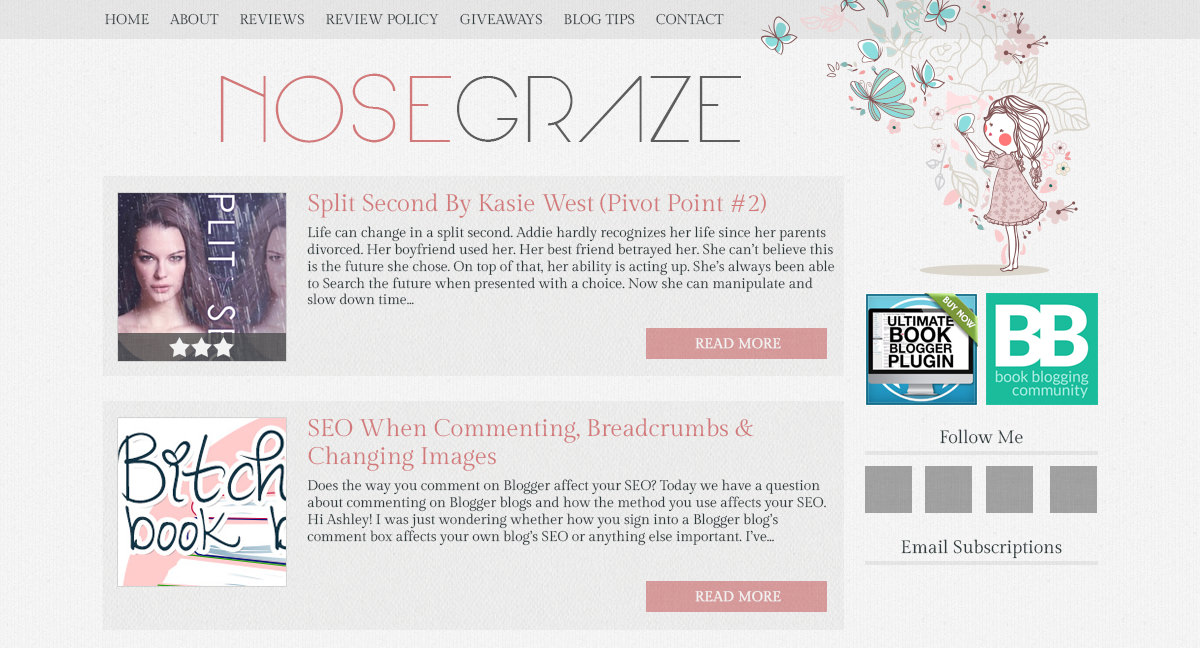
Girl With Butterflies Design
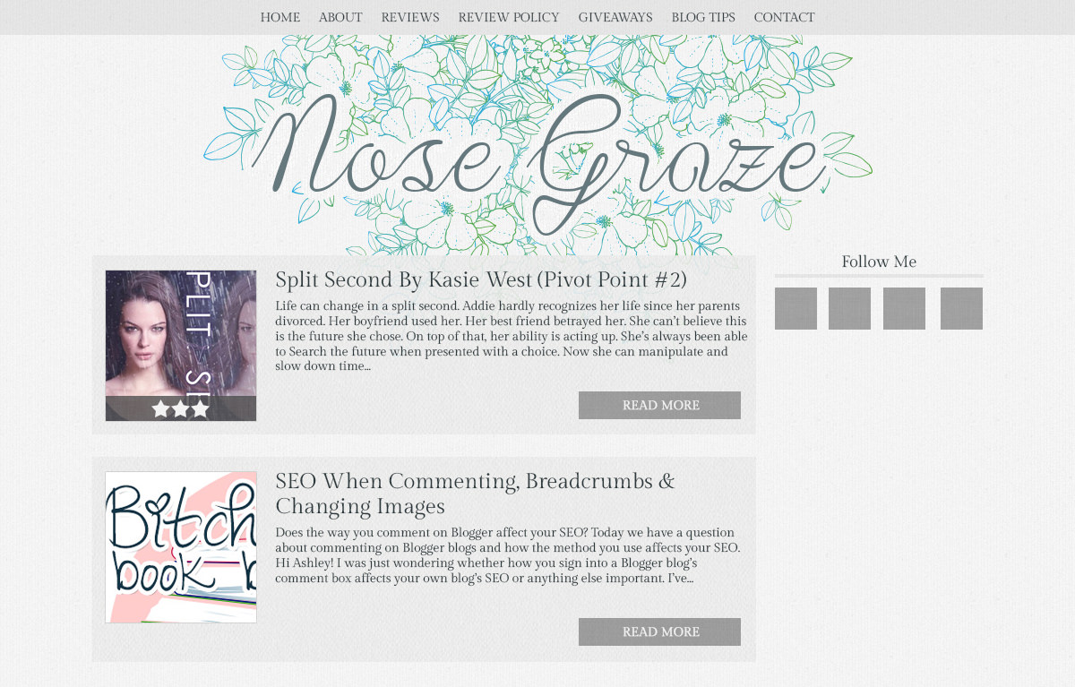
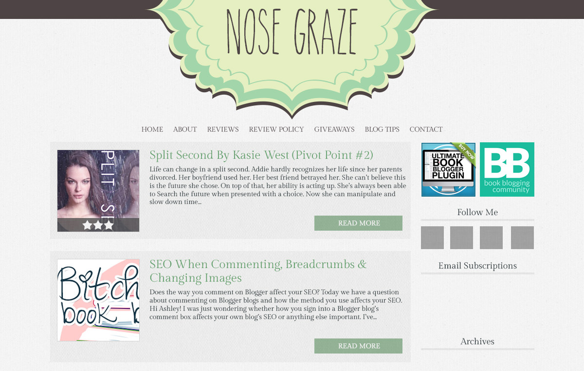
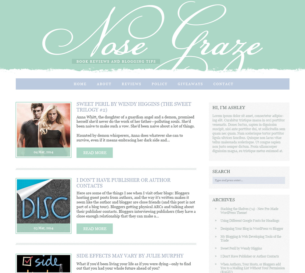
Green Blog Design
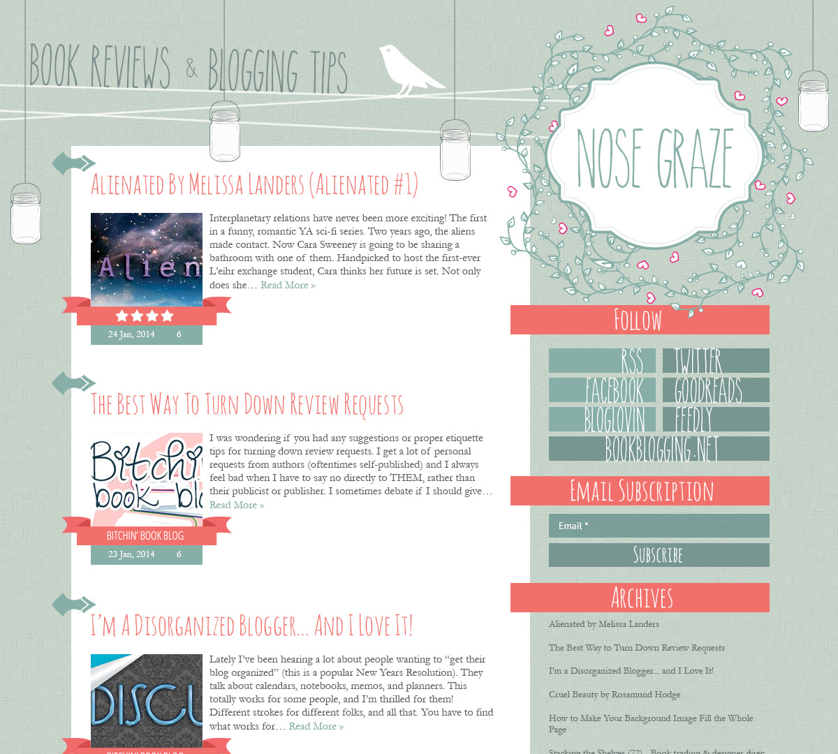
Birds and Mason Jars Design
It looks like I’ll be selling this design to someone else!
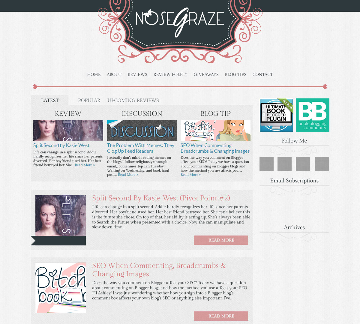
Pink and Grey Design
Green and Blue Design
I like all of them actually… But my favorites are: girl with butterflies and the pink and grey!
Thanks! I think I like the girl with the butterflies too. 🙂
AlI of them are gorgeous but I love the second to last one, it’s simple yet beautiful 🙂
AHHHHH. They’re all so pretty! “BIRDS AND MASON JARS DESIGN” is my favorite but if you’re selling it.. the first and second listed are my second and third favorite!! Though I really like the sidebar in the third one too.
I really like the mason jars one too, but I think I decided to sell it because I wasn’t clicking with it for me. I love it overall, but I’m not sure it’s right for Nose Graze, you know?
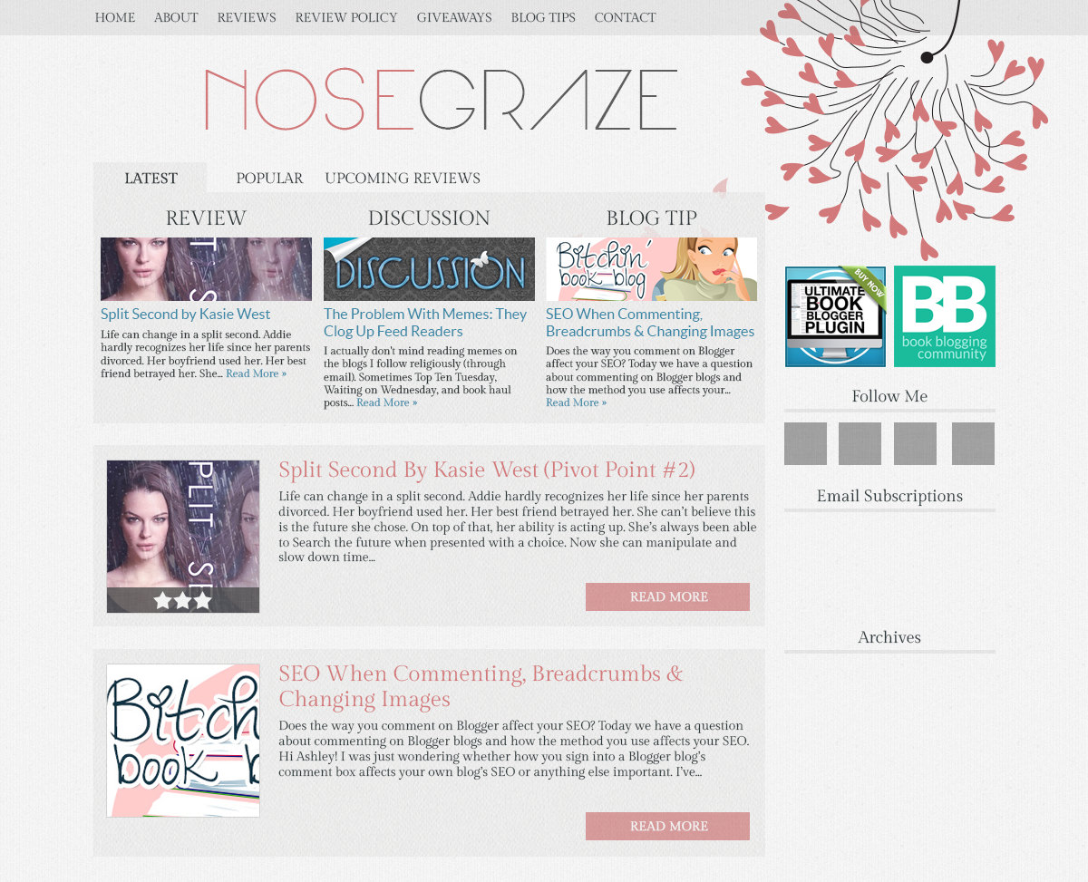
I get you! Nose Graze has a really professional design and these are all very minimalism, I’d say that the pink and grey design (the header) would fit the blog more than the others. It’s one of the more incomplete ones too so it has definite potential in my opinion!
JESUS, ASHLEY. These are all insanely gorgeous! No wonder you’re having a hard time deciding! 😀
My top three favorites (in no particular order)!
1. The flower doodles design. The flowers + the font = sooo beautiful!
2. Girl with butterflies design. That graphic is soooo pretty!
3. Green and Blue design. The colors compliment each other very well. And that font, Ashley, SO IN LOVE!
(Psst, tell me these font names! ;D)
Haha thanks Cee! 😀
Here are the fonts you liked:
* Flower Doodles: Lace
* Butterflies: Arual
* Green and Blue: CHampignon
I knew right away when I saw it. Flower Doodles. For Sure! I am excited to see which one you pick.
Thanks! 😀 I really like that one too. I have a feeling I may have to code like 3 of them and then see which one I like best lol X_X
well if you think you’re indecisive, then double that for me. I like elements from ALL those designs. But I think the “girl with butterflies” would be my favourite…i really dig the title font for “nose graze” and the girl design is VERY cute. On the other hand, I really like your current design – I find it bold and colourful and not too eye-gouging. LOL. I’m trying to come up with a redesign myself right now, so I feel your indecisive pain. I just signed up at this new hosting place…Book Hose..perhaps you’ve heard of it? *grin* And yeah, right now, I’m going down the same path as you…trying to come up with a design that is eye catching and won’t blow out anyone’s eyeballs. 😀
…and that would be Book HOST, not Hose. Cos that just sounds weird, right? 😀
LOLOL I laughed so hard at Book Hose! I think it’s time to rebrand my hosting service into that… haha.
Heh. I lost track of the amount of times I typed Book Hose, AND Book Nose when I was recommending it to a friend *laughs* (who btw, is very interested and should be taking the plunge very shortly..yay!)
Awesome, thanks for spreading the word! 😀
No probs. I also just recommended you as a website designer to a friend yesterday, so hopefully she’ll get in touch with you too. 😀 I’m one of your biggest fans, so I recommend you to all and sundry. LOL.
Hey you – welcome back 🙂
LOL do you know how long it took me to find your blog Rosemary? *grin*
Thanks Jaki! I really like my current design too… That’s why I’m so indecisive. On the one hand, I’m very happy with my design. But on the other hand, I feel like it’s time for something new. But that also means I have very high standards and I feel like I’m not sure if any of these new designs are good enough!
#sigh
1. Birds and Mason
2. Dandelion
3. Pink and Grey
I always feel fussy with my blog design! Luckily the lovely Ula @ Blog of Erised makes what I want come to life haha. These are absolutely beautiful designs, Ashley! 🙂
Um, if you don’t want it, I would totally pay for the ‘girl with butterflies’ design. It’s absolutely gorgeous. The dandelion and the first flower doodles are also beautiful. I mean, they’re all lovely designs, but those would be my picks.
Thanks Chantelle! I probably will be selling all the ones I don’t use. 🙂
I reeeally like the Girl with the Butterfly! It’s gorgeous! But they’re all quite fabulous. 😉 I’m having trouble deciding what style of design I want right now, too. Except I know nothing about blog design or css and I’m working with picmonkey, lol XD I can’t wait to see what you pick!
so much prettinessssss! I never know what I want with my design and I keep redesigning it over and over again, that’s just me I guess. I don’t know what design I like best, I really like all of them!
The Pink and Grey one or the one with the girl and the butterflies. =)
Wauw, I especially love BIRDS AND MASON JARS DESIGN, it is really perfect!
Thank you! 😀
I like them all, but my favourite is the first one. 🙂
I like them all! My fav are the Flower Doodles and The Girl with the Butterflies, they are awesome! Great work 🙂
Birds and Mason Jars!!!
I like the Flowers Doodles Design because it brings in some of the colors you already like but in a different way. But I also LOVE Flowers doodles design 2. It’s too pretty not to like.
That’s an excellent point, thank you Nina! 🙂
I love the birds & mason jars design! The colors are fun without being obnoxious, and the mason jar lights + vines make me think of my home back in Mississippi. ^_^
I like birds and mason jars and dandelion love. I can’t wait to see what you decide 🙂
Love love the Birds and Mason jars design!! Girl with Butterflies is also so adorable :3
Dandelion Love Design, definitely.
The Pink and Grey and Girl with the Butterflies are my favourite 🙂
I like the girl with the butterflies design. They are all cute though.
Oh gosh. I am having trouble coming up with one redesign let alone pick one of your 6 fabulous ones. 🙂 how about I just tell you that the green and blue is not my favorite. It pales in comparison to the others though I do love the colors. I really lovegirl with butterflies.
Thanks for your input!! 🙂
I really like the BIRDS AND MASON JARS DESIGN but if you’re going to be selling it, the GIRL WITH BUTTERFLIES DESIGN is also super cute! I’ve never really LOVED my design but I’m not bothered to create a whole new one from scratch just yet. Good luck Ashley!
Those all look really good. I have wanted to redesign mine but don’t have the knowledge or no how..lol. I like the flower design #2 and the bird and mason jar one. 🙂
I really like the blue and green design, and also birds and Mason jars!
I love the first one (dandelion) and the mason jar one! But they’re all lovely so whatever you go with will be pretty. You’re making me itch to get a new theme for my blog!
I like the “girl with butterfly” header the most, maybe with the highlight box (the module with the tabs) of the “dandelion” design. Though I think the nav is easy to miss and overall, it might not be as special a design as the one you have now. The current design is quite classy (with the texture in the back) and sparkles with energy thanks to the high contrast of cyan over dark grey.
In my opinion, the “birds and mason jars” shows more personality but it rather makes me think of a cooking blog than a book blog, so I wouldn’t vote for this one for Nose Graze.
Maybe if it didn’t click, give it a bit more time. Sometimes, it helps to forget about it for a little while and then look at it again with fresh eyes.
… but you know that already :))
You’re right, sometimes it does help to forget about it for a while! Another thing that helps me is to actually code the design as if it’s going to be my new one. I find that I actually do a lot more designing, tweaking, and refining during the coding process than the graphical mockup process! My original mockup for this design was a stupid mess. But once I got to coding it, that’s when I really started tightening it up and making it look a lot better!
My favorite is “Pink and Grey Design” 🙂 Very nice. My next fave is “FLOWER DOODLES DESIGN #2”
Pink and Grey
You should do the pink and grey one
They’re all nice! But I think my favorites are….Green and Birds and Mason Jars! 😀
I know that personally it’s always so hard to choose a new design for my blog, so I can only imagine what it must be like for someone with your talent to be able to make so many!
Really and truly they are ALL gorgeous, so whichever you pick will look amazing no matter what.
Will you be selling the themes that you don’t end up choosing? Love the birds and mason jars one, but also the dandelion one and the flower doodle #1.
The green and blue is kinda simplistic and cool, too.
See, I can’t choose just one. They’re all so lovely!
The girl with the butterflies is awesome but it would be nicer if she was holding a book instead.
Yeah I’ll probably be selling all the themes I don’t use. 🙂
My two cents – Birds and Mason Jars, but if you’re selling it that’s off the table. Second choice – Flower Doodles #2.
Wow, Ashley these are all reallllllly pretty! That birds and mason jar is GORGEOUS but if I have to pick a favorite I would go with girl with butterflies.
I love the layout for the Dandelion Love one – in fact, I like that almost best. 🙂 I like the colors of them all. Hard to choose. 🙂
My vote would be either birds and mason jars or girl with butterflies! Love love love these, Ashley. You’re seriously such a talented web designer! I’ve never been particularly indecisive when it comes to my blog design because I never have these many fantastic ideas! Mostly, I just get one idea and I enhance it from there. 🙂
Wow! I wish I had this problem lol. My brother did my design and I love it – which is a good thing because getting a new design without paying someone would be pretty impossible. Anyway – love them all but my favorites are (in order)
1. Flower Doodles #2
2. Green and Blue
good luck! Can’t wait to see what you end up with.
They are all great, I especially like that they have a header, sort of, built in – that is my biggest problem. I like them all, but I really, really like your current blog theme. It is eye catching and easy to navigate. I love it.
I really love the mason jar and bird design (ahhh I actually might buy it if it’s available), but if it’s not clicking for you then I think the Girl with Butterflies or Dandelion Love one is my favorite 🙂
Sorry but the mason jar and bird design has been spoken for. 🙁
I know the feeling so well! I really like a lot of these designs, but I definitely understand what it’s like when you bust out a ton of ideas and many of them are good, but none just *click*. If I had to choose from these, though, I think I like these three:
1) Dandelion Love: I like the font used in the header — it’s different and interesting to look at. I like the simplicity of the design and color palette. It’s nice to look at without being distracting.
2) Girl with Butterflies: Again, that same font in the header! But I think the girl with butterflies image is a bit more eye-catching and colorful. I like the way it blends into the header a bit, too. I feel like it says a bit more about the blog, adds a little more character, you know?
3) Pink and Grey: I like the decorative header at the top, and that it looks recognizable compared to your current one, but with a new spin on it.
I hope you can decide on something that you’re happy with, and I can’t wait to see what you end up doing! 🙂
Thanks Kelley! I think I agree with all your points, and those three are definitely my favourite too. I might be leaning towards the Girl with Butterflies design. I might code it and see what happens! Oftentimes I add most of my final touches that really pull a design together during the coding phase. So maybe once I have it all coded up it will totally scream “Nose Graze” at me!
I do love the look of the Birds and Mason Jars one, but the Girl With Butterflies Design would have to be my favourite. They all look brilliant though!
Girl with butterflies design is my pick. I like the clean look. My second pick would be pink and grey design.
Flower Doodles definitely #1 for me.
Green and Blue!
FLOWER DOODLES DESIGN #2
GIRL WITH THE BUTTERFLIES!! It’s so simple and clean and I just love it <3
These are AMAZING! I think my favourite would have to be Birds and Mason Jars because of the color scheme but since you’re selling it, I also really really like Green and Blue and Flower Doodles. But honestly, these are all so good!
I’m all about the second flower doodle one! Very nice, simple, and the monochromatic color scheme will not take away from all the other graphics on the site!
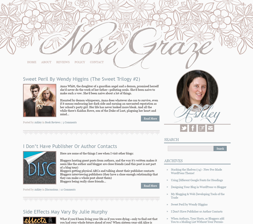
Okay, first of all I love all of them. I actually really love your design that you have now. It’s very unique and I love the color scheme, especially the light blue which is close to my favorite color so I’m a bit biased.
I really like the Flower Doodle Design. I also love the pink and grey design but wish is was blue – again I’m biased 🙂 The Birds with Mason Jars and the Girl with Butterflies are really nice too. The Green and Blue design is very nice too and still feels like what your site is now. Sorry I’m not much help, I like them all.
Girl with butterflies is my favorite, I think. They are all so gorgeous! Pink and grey looks professional and pretty too 🙂
I like The Girl With Butterflies but maybe consider changing the butterflies to something like books or colorful sheets/ribbon bookmarks to match with the theme of the blog? Just a thought…
All of these are beautiful! But I really like the girl with butterflies one. I am working on redesigning my blog as well! And by working, I mean asking my graphic designer friend to help me pretty much do everything. Lol. It’s tough to settle on something.
Aww I love all of these designs, they’re so minimalistic and beautiful. I really love the pink and gray one, maybe because it reminds me of your current design but it’s a lot simpler and cuter in a way 🙂 But I also really love the mason jar and girl with butterflies one 😀 Fantastic designs, Ashley! <33
I love your current design! You could update this one, possibly? I love your header and menu.
But saying that, all these redesigns are beautiful too. I honestly wish I has your web design talent. 😛 My favourites would be Green Blog, Birds and Mason, and Pink and Grey. They’re simply beautiful.
I hope you come to a decision! I know whatever you choose to do, you’re blog will always look amazing. 🙂
All of them are gorgeous! Pink and Grey and Dandelion match you and your blog perfectly (to me) because they remind me of what you have now, just different in design. Everything is where I am familiar with it being and nothing is hard to find.
I really like them all, but I’d say my favorite is the Flower Doodles.
Girl with Butterflies!
Then again, I don’t know that it screams “Nose Graze” at me. It’s pretty frickin adorable though!
For your blog, I think my favourite is Pink and Grey. But I really like the font treatment from Girl with Butterflies.
I don’t know how you’ll ever decide! Haha
Yeaaah, I want them all. Really, I want to know how you did the images. I’d love to learn how to do photo manips and up-to-date coding. I think my fave is the one with the girl though. 🙂
I love the Mason Jar one, but honestly they are all going to look great on your blog.
I really love the daffodil one! It really caught my eye, and the header font goes perfectly with it. Of course, my favorite was the mason jar one – so cute, but it might be for soemone else. I am loving the soft looks!
I love the Birds and Mason Jars, but I can see it being one you sell… for your blog I think I like Pink & Grey or Flower Doodles #2.
I absolutely love the Bird design – too bad you are going to sell it!
Then my second fav would be the Girl with the Butterflies 🙂
I think GIRL WITH BUTTERFLIES DESIGN is the coolest in my opinion 🙂 It’s very different from what you have now though, so maybe you could carry over some of the colours from this one for continuity? I can see that you’re generally moving away from the blue/grey of this design to a whole different colour scheme, so maybe this isn’t an issue?
I also love PINK AND GREY because it uses a very similar header to what you have now, but uses new colours, and I luuurrrvveee the divider under the menu bar (so much that if you DON’T choose PINK AND GREY, I might try and do a similar under my menu bar).
Oh, I really like the pink/gray ones! Either the dandelion or the girl with butterflies! But I do like the divider on the flower doodle # 2 design? Also, that mason jar lantern design is gorgeous!
And lol, if I had more time I’d probably be redesigning my blog every 2-3 months haha.
What do you use for the doodles, if you don’t mind me asking? 😀
My favorites are Flower Doodles and Pink and Grey, but they all look great.
I think I like Flower Doodles best assuming that you’d put more in the sidebar and perhaps continue that green/blue in a few more places ;-). I just really love those two specific colors together for some reason 😀
I’m sorry but I really don’t want you to change your design! They’re all so gorgeous and you should definitely sell them on Creative Whim, but your current design is so perfect! It really makes you blog stand out from all of the run-of-the-mill “pretty” blogs. They’re gorgeous but they don’t really stand out against all of the other gorgeous designs that a lot of book bloggers have.
I think your current design is very pretty but professional. I’m afraid that I associate your current design with your blog too much to let you change it without a fight!
Thank you Jennifer! I really appreciate your input. 🙂 I think part of me feels the same way!
I can understand why you’d want to change it though. I think most bloggers want to change their theme every few months no matter how much they might love it, so I can definitely see where you’re coming from.
But for me, you’ve really built a brand with Nose Graze and it’s current design is your logo. It would be like McDonalds getting rid of the gold M!
I think I have to agree with Jennifer and was what I was thinking but didn’t say. I love the colors, I love your logo which is simple and elegant and I don’t know, I just know this place by sight and I like it. It’s sort of like any good logo, you just recognize it immediately and it stands out in a crowd.
I see what you mean! 🙂 Thanks for your thoughts Jamie!
I think I like the pink and grey design the best. Good luck and I hope you love whichever one you decide on!
My first choice goes to GIRL WITH BUTTERFLIES DESIGN.
Second choice goes to DANDELION LOVE DESIGN.
You got talent! I actually quite like the others too. What a struggle you must be going through just to decide. Lol
Btw, I love your current design as well. And I haven’t gotten bored of it yet. 😀
Oh, wow, there’s so many pretty designs *O* My favorites are the Girl With Butterflies Design, the Birds and Mason Jars Design, the Pink and Grey Design… and the Green and Blue Design. Eek, I really didn’t help at all, did I? D: I’m sorry! But all the best with picking a new design! They all look wonderful ^^
Oooooh!! 😀 These are all so pretty!! :3 I absolutely adore the Mason Jars and Birds design, and the Girl With Butterflies design is so adorable!! 🙂 However, I think the Pink And Grey design really screams NOSE GRAZE!!! and ASHLEY!!! so it would seem to be the best pick for Nose Graze to me ^^
I have a blog redesign problem. I have been frequently changing my blog around and I really should stop.
As for Nose Graze, I love how your blog is right now! But if you want to change it, I vote for the one with butterflies. Pretty!
I really like Green and Blue or Flower Doodles #2. Both are really sophisticated and elegant.
I REALLY love the top of the pink and grey design!!!