
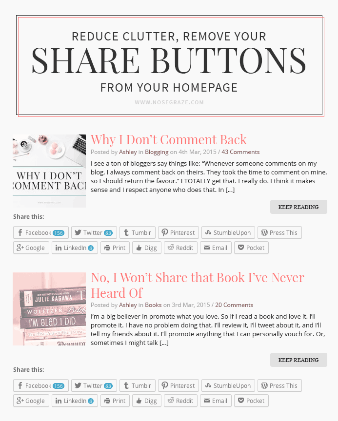
One of my pet peeves are blogs that have excerpts on their homepage AND social share buttons.
Here are two awesome reasons why you should not put social share buttons on your homepage:
- It looks cluttered. This is mostly the case if you use the big, bulky social share buttons from Jetpack. If you have smaller, text icons or links then it’s not as big of a deal. But those big ones from Jetpack are MASSIVE and there’s like eight of them or something! I often see the buttons span over two lines.
- I won’t share your post before I’ve read it. I’m not going to read the title of your post and that short, 50 word excerpt and share your post. If I’m going to share it, I’m going to do so after I’ve read the entire post.
Share buttons are really important AFTER readers have read the post.
I think it’s important to have share buttons at the bottom of the post. When someone is done reading, they might think to themselves, “Wow, that was a fantastic article! Other people should read this,” and then want to share on Twitter, Facebook, etc. But that thought isn’t going to come until after they’re done reading. That’s why it’s pointless to have the share buttons after only the post title and a 55 word excerpt.
Do you have share buttons on your homepage?
If so, have you thought about removing them?
Note: I think it’s fine to have share buttons on the homepage if you also show the full post.
I did until I read this post. Honestly I hadn’t realized that I could turn them OFF on my homepage until I went digging into the settings. Otherwise they would have been removed long ago. Guess that would be one reason I still consider myself a newbie blogger. Thanks!
Great job removing them, Silvara! 🙂 *high five*
I never realized they were on. But I found where to turn them off now. It definitely helps with the clutter.
Nice job, Katrina! 🙂 Here’s to a share-free homepage, haha.
It does look cluttered, I agree. Yay I don’t have them. BUT I do have the Jetpack “like” on the front page under the excerpts and I don’t know how to make that go away.
Sadly I can’t offer any advice on that. 🙁 I don’t use Jetpack so I’m not super familiar with the settings.
Go to Jetpack Settings, then scroll down to where it says Like, and on the right side will be a link that says Configure if you hover in that area. On THAT page, at the bottom, untick the box that says “Front Page, Archive Page, and Search Results” under the Show buttons on heading.
Thanks!!
I do, but only Twitter and Facebook. When it comes to share buttons, always remember the Goldilocks principle: everything should be just right 😀
Yeah yours are fine because they’re super tiny. 🙂 They use up the existing space well, rather than adding more.
(If I do say so myself 😉 )
I’ve actually never thought of share buttons before, tbh. I don’t even use them.
I don’t share posts with a button. If I really feel the need to, I’ll probably do it manually. You’re right; buttons like those look so cluttered and if anyone is like me, they probably won’t even make use of them which sucks.
You should consider adding them to your individual post page. 🙂 Even if you’re a “share manually” kind of gal, a lot of people aren’t. They won’t share at all unless there’s a button there. So if you consider adding them, you might see an increased amount of traffic via social media. 🙂
No I don’t have that. It looks, like you said, cluttered and messy. :p
Atta girl!
I didn’t realize the sharing buttons could be on the home page before reading your post! Anyway, I’ve double-checked and confirmed I didn’t have them on my home page. Thanks for pointing that out!
Nice job, Regina! 🙂 Here’s to keeping things simple.
I’ve never seen posts like that. Definitely looks cluttered. Good to know for future reference.
I don’t see it too often, but every now and then I do. I always think to myself, “This blog would look so much better if those buttons weren’t there.”
I use the Eliza theme, so yeah, I have twitter and facebook on the front. I love them and think they are totally cute. I eventually want to use the Tweak Mev2 theme that I bought, so I want to figure out how to have them with that as well.
Yeah I purposely designed the Eliza ones to be super small and subtle. 🙂 No clutter/bulkiness like with the Jetpack buttons!
My share buttons are built into the theme, it looks good, and it’s not intrusive at all, so I’m not getting rid of it. 😀 They’re just small and easily overlooked.
Do you have a recommendation for a plugin, etc, that does a good job of share buttons? Or should we just use the one in Jetpack?
Well I use TF Social Share on my blog. I like how it uses the default buttons so they’re recognizable, and I just like how it works.
When I redesign my blog I’m actually coding my own share buttons. 🙂
So HOW do you remove them?
Never mind.
I have been trying to figure out how to remove those pesky buttons from my blog and you just solved my issue! I didn’t realize that the social share buttons were a feature with Jetpack. Great post! Thanks!
Not sure what just happened but they went away and now they are back. I’ll need to figure this one out still 🙁