
I’ve always been stunned at people who insist on NOT having a responsive design. Do the enjoy having to pinch in on their phones and then scroll both vertically AND horizontally? Horizontal scrolling is THE WORST. I always lose track of which line I’m on.
But you know what? I let them do their thing. I thought it was a poor decision, but it was ultimately up to them.
But this is changing.
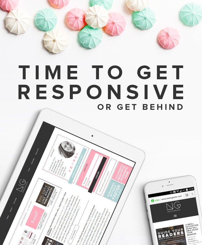
It’s time to get responsive or get behind
It’s been over a month now since the announcement, but Google recently posted that starting April 21st, they will consider whether or not a website is mobile-friendly when ranking it in Google searches.
Starting April 21, we will be expanding our use of mobile-friendliness as a ranking signal. This change will affect mobile searches in all languages worldwide and will have a significant impact in our search results. Consequently, users will find it easier to get relevant, high quality search results that are optimized for their devices.
That means if your site isn’t mobile friendly, you can expect to see your rankings drop.
Google never tells us exactly what goes into their search algorithms, or how much weight each factor has. But SEO is like a stacking game. There isn’t one single thing you can do that will make your ranking skyrocket. It’s all about “stacking” lots and lots of little things, and having a mobile-friendly site is now one of those factors. It’s not something you just want to ignore.
My guess is that if your site is not mobile friendly, then your site is going to show up a lot less often when people are Googling on their phones or tablets. Google tries its best to deliver quality, relevant content to the searcher. If your site isn’t optimized for mobiles, it’s not going to be the best choice to someone who’s on a phone.
Stop clinging onto your beautiful desktop design
One of the biggest arguments I’ve seen against responsive design is that the designer is heavily attached to how the design looks on desktops. Responsive design is about sacrifice. It’s about stripping away elements of the design to server a simpler, more optimized version to the mobile user. If you’re a designer, it can hurt to strip away your beautiful design elements. But it’s time to move past that.
Trying to navigate a desktop site on a mobile is ANNOYING. That pinch, zoom, scroll shit I mentioned before? HORRIBLE.
Your design might rock, but if I can’t actually navigate around or read your site, I’m not going to like it.
On a phone, crisp, clear, easy to navigate, and easy to read is going to beat design.
- Give me simple
- Give me minimal
- Do not give me distractions
- Do not inconvenience me
Check to see if your site is mobile friendly
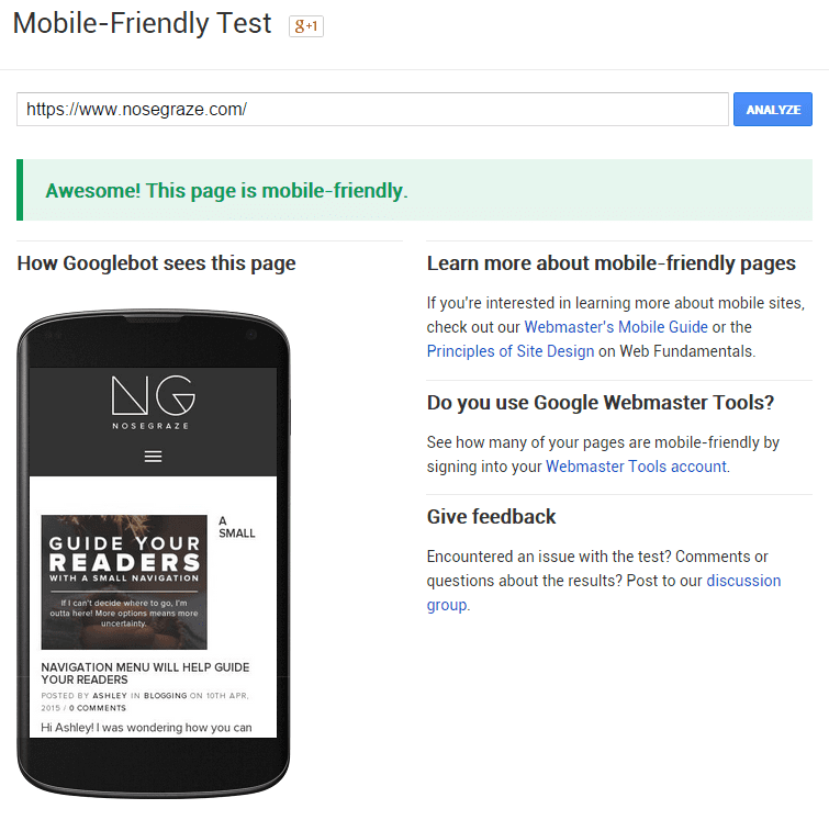
Google has released a free mobile friendly test. Just pop in your website URL, click Analyze, and Google will tell you whether or not it thinks your site is mobile friendly.
Tips for having a great mobile site
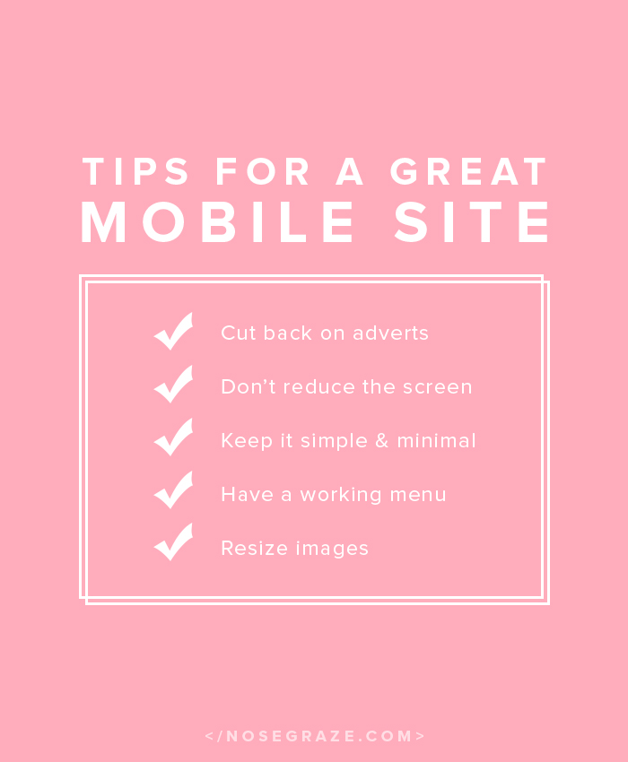
- Do not restrict the view port. If you have a Hello Bar at the top and and advert at the bottom, you’re now cutting the view screen in half! This is ANNOYING to read. I discussed this when I talked about my website pet peeves.
- Make sure your navigation menu works, including sub menus that normally activate on hover. Phones and tablets do not have hover functions!
- Your images should resize to fit the screen. This can be done with a simple bit of CSS:
img { height: auto; max-width: 100%; } - Make sure your columns collapse. That means your sidebar should move from being next to your content to being below it (or not appearing at all).
- Hide the non-essentials. If something doesn’t NEED to be there, then don’t let it show up on phones. You can throw some pretty extras onto the desktop site, but phones are small and might load slower if the person is using their data plan. Don’t clog your site up with unnecessaries that will make it take even LONGER to load your site.
When I activate the mobile version of my blog, the menu under my header disappears. And the menu is really important, obviously, because otherwise people can’t go anywhere. So I’m not sure what to do. :/
That’s probably because you have a navigation menu that’s “hard coded” into your template? But then I think the mobile theme uses your “Pages” gadget or something?
I don’t use Blogger so I’m far from an expert there, but I do believe that’s the problem.
Here’s someone who had the same problem: http://xomisse.com/blog/create-a-drop-down-navigation-menu/#comment-53455 Maybe you could get in touch with the blogger to see if she ever posted the proper fix for it.
It’s definitely worth investigating rather than ignoring!
I think you’re right. Thanks for the link, I’ll check it out 🙂
Interesting post! I agree that it makes sense to have responsive sites from a logical (and now marketing) POV, but to be honest as a user I find it VERY annoying when a mobile site doesn’t have all the functionality of a desktop site. When that happens, I’d rather use the desktop site and zoom in than use the mobile site and lose functionality!
I just used the test you linked and it says that my site is mobile friendly, so it seems I won’t have to worry about search rankings. 🙂
In my experience, that overly stripped down version is more the case when you use a mobile theme rather than a responsive design. A responsive design is usually the exact same website but with slightly different styling (collapsed columns and stuff). A mobile theme is a completely different template.
You can read a bit about the difference here if you want to learn more. 🙂
Ah, thank you for this post! I’d been wondering lately about mobile responsive designs because I’d seen people complaining about how hard it is to leave comments on ones that aren’t.
I’ve used the nifty Jetpack mobile theme setting, and it’s actually pretty good. When I save a bit of money I’ll likely fork out the $ for my actual theme to be responsive and to keep the pretty elements but for now I’m happy enough with what it looks like.
Funnily enough, even though I’m looking at my iPhone and getting a mobile responsive theme, the Google checking thingy says it is not *scratches imaginary beard*
The issue with Google could be because you’re using a separate mobile theme instead of a responsive theme.
The way a mobile theme works is by detecting whether or not the device being used is a mobile device. The code that does that is imperfect, especially if you have a caching plugin.
The way caching works is by saving a copy of the webpage and then serving that copy to the next viewer instead of “regenerating” the page all over again. So now imagine this scenario:
1. Someone views your site on a desktop computer. So the code to determine whether or not it’s a mobile device gets triggered and it gets determined that it’s NOT a mobile device. So the viewer sees your normal theme instead of a mobile one.
2. The caching plugin saves a copy of that page. In this case, it’s the desktop style theme.
3. A few minutes later, someone visits your website on their phone. Your caching plugin sends the user that saved copy of the page. However, the copy that was saved was for a desktop! But since the plugin is serving a copy, that “is this a mobile device?” code doesn’t get run again. So the mobile user gets your desktop site incorrectly.
The reason why responsive themes have a leg up is because they don’t use this device detection code to switch themes. The exact same theme is always used. But there’s code in the CSS that checks the width of the device and adjusts the layout accordingly. But since it doesn’t actually CHANGE the layout, it’s not affected by this caching problem.
It’s kind of hard to explain, but hopefully it makes some kind of sense!
Thanks for linking to that url where I can check my sites. I am always on my desktop so I never knew whether my sites were mobile friendly or not. I never bothered to check, but with that announcement from google, it’s certainly got more important. Going to check my sites now.
You’re using Tweak Me so you should be good to go! 🙂
However, I did notice that you don’t have your mobile navigation menu set. Be sure to assign a menu to that spot in Appearance > Menus.
Yes I was happy to see that Lola’s Reviews looked great on mobile, I am still discovering functions of the tweak me theme that I didn’t know it had! Thanks for the tip about assigning a menu, will check that out!
On the other hand my other site Lola’s Blog Tours is horrible and scored bad on all points, ugh. Apparently that isn’t a responsive design. Is there a plugin that you recommend that can help with that?
There are several “mobile theme” plugins you can use, including:
* One with Jetpack
* WPtouch plugin
Using a mobile theme isn’t quite as good as having a responsive design, but it should let you pass as far as Google is concerned. 🙂
Thanks for the recommendations! I already have Jetpack installed on my site, so I’ll check that option out first and else check out WPTouch.
I had no idea that this plays such a big role in Google searches. Good thing my blog is mobile-friendly 🙂
*high five* ! 😀
All mobile ready. Thanks to you!
My pleasure. 😉 I don’t even give my clients the option of NOT having a responsive website because I think it’s a mistake to buy one that isn’t responsive. They’re far too important.
I’m using tweak me so my site is mobile-friendly. However, I noticed 2 things. When I used the site you did to test it has my site is blocking google bots so it doesn’t show as it would on a normal browser. Is that a problem? Then I tested it on my phone and my site looks nothing like it should. Looks like WP colours. At the bottom it has view full site and then it takes me to the nice mobile version of my theme. Any idea how I can make it go straight to my mobile version.
You have a mobile theme activated. Probably the Jetpack mobile theme. So you’ll have to dig around in the Jetpack settings to deactivate that. 🙂
As for the blocking problem, that means Google can’t see your CSS/JavaScript. That’s why the preview on the mini phone looks wrong and totally unstyled. It’s not a huge issue, it just means that Google won’t see your site the way people do.
Ahhh… Jetpack. I’ve disabled the mobile theme and I see it works now. I had that activated for my last theme because it didn’t wasn’t responsive and I forgot to take it off. Thank you for your usual helpfulness.
Mine was mobile friendly, yay! I know I use a free site but it’s still awesome!
Yes, WordPress.com has great themes. 🙂 Automattic (the company behind it) has high standards for their themes, which I think is fantastic!
HA, we were just talking about this last week! (Thank you, BTW)
One question that I had – on my of my blogs I use the jetback mobile version, so couldn’t other do that too without worrying about their current theme?
Having a mobile theme isn’t quite as good as having a responsive design, but it’s a good alternative if you don’t have a responsive design and don’t want to or can’t afford to get one. 🙂
Yeah, I have this WP plugin installed that cleans everything up on its own. I never used my blog on my mobile (just the tablet and it worked fine there) but then I saw what it did to my header (*shudder* – not that it’s anything special, but still) and immediately fixed it.
This was so helpful! Thank you! My blog is now mobile friendly. I have friends who read my blog on mobile and I didn’t realise that it wouldn’t have been easy for them to read and I personally hate having to scroll horizontally as well, its a nightmare! I’m glad and relieved now that I realise my blog will be easier for people to access.
I get so paranoid anytime mobile is mentioned and check and feel better, haha. How do you feel about WP Touch plugin for making a phone version of your site?
It’s not as good as having a responsive design, but I believe it should make you pass Google’s test. 🙂
This is very helpful! I use Blogger and it has its own mobile design (which I hate) and I want to customize it.. Does anyone know how?
Zoessecretstyle.blogspot.co.il
Great post! Thank you! I have Blogger, but the analytics said it’s mobile friendly! Yay!
Yes, Blogger comes with a mobile version by default, I believe. 🙂
I really liked this post. I didn’t have a mobile version for a while because I didn’t have the time to make it work properly but now I do and it passed the google test =)
This has only recently become important to me. I’ve tried to have a mobile friendly layout on my blog for other people, but other people having them has recently become important to me. Since having my daughter, I find that I read more things on my phone than I would really like to. I hate finding sites that aren’t phone friendly. I end up having to email them to myself to read on my desktop later, which is a pain in the bum since I end up flooding my inbox and then dealing with them all in bulk. It’s more hassle. I would rather be able to sit there and read them late and night when she is fussing her way into sleep and just can’t stand me not to be in the room with her.
Ugh I sometimes do that same thing with emailing myself links. It’s a huge PITA X_X
Boo, Google can’t fetch my url to see if it’s mobile-friendly or not, but when I access on my phone no weird scrolling or zooming has to happen, so I think I’m ok at least a little bit. I had no idea about this change to their rankings…good to know!
Thanks for the handy link! It says my blog is mobile friendly, so that’s great news :)!
My blog isn’t striped down or plain by any means but I was so very happy to check with that link to see that it is very mobile friendly. I checked it out myself and it looks really good! I never would have thought about people looking at my blog on their mobiles since that’s something I don’t usually do. Thanks for the tip!
Says my site is mobile friendly! Woot Woot!
Is there any way to customize the mobile theme in Tweak Me? For example, not include the sidebar?
Not in the settings panel. It would have to be done with custom CSS code. 🙂