
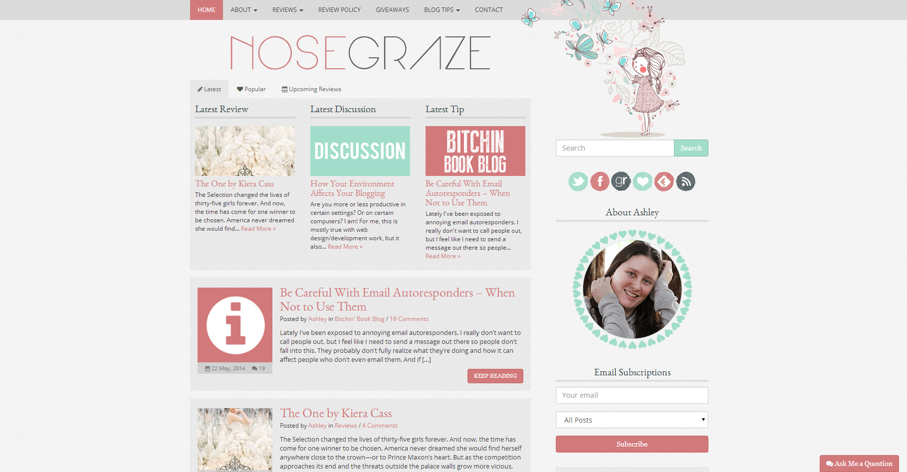
With UppSite Mobile announcing today that they will yank their plugin in July (this is what I was currently using) I’m wondering what people without coding skills use to make their Website/Blog mobile responsive? Better yet, how can someone customize the look of their site on a mobile device? Thank you!
Kayla
Hi Kayla!
Unfortunately, you cannot use a plugin to make your blog responsive. Having a responsive design is achieved only through the code in the design itself. You can’t just install a plugin and make it responsive, because the plugin has no idea what the structure of your website is. It’s just not possible for it to figure that out and magically make it responsive. The responsive functionality has to be 100% integrated into your existing design code.
That being said, there are several other options for creating an instant mobile version of your site.
The difference between a mobile site and a responsive design
Having a “mobile site” and a “responsive design” are not the same thing, so before I go any further I’m going to talk about the differences.
A mobile site is completely separate
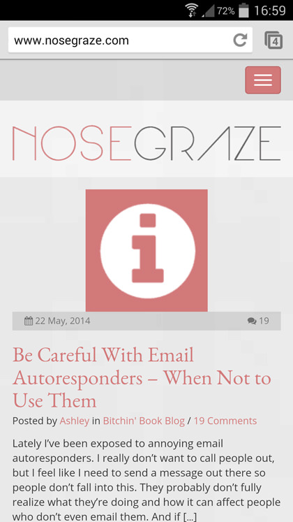
When you use a plugin to create an instant “mobile site”, it’s a totally different design. You have one design for desktop computers, and another totally separate design for mobile devices. The mobile design is activated whenever a mobile device is being used to access your blog.
The main feature here is that it’s like a switch. You turn on mobile site, or you turn it off and get the desktop site. They’re totally separate.
Responsive design is a feature in the original design
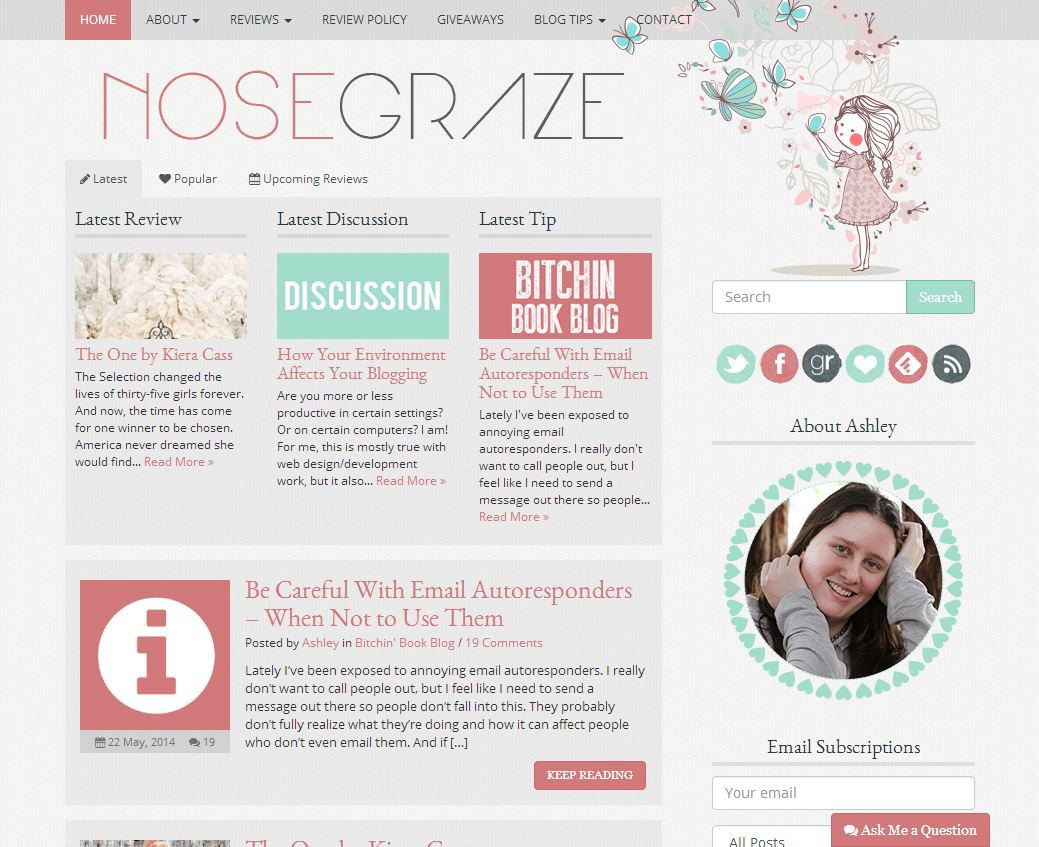
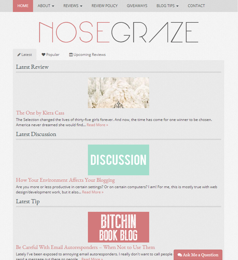
If your site is responsive, it was coded that way from the ground up. This means you have one design on your blog. That one design adapts and re-sizes for different screen sizes and devices. If you were to slowly resize your browser (from large to small), you would see the design modify itself to accommodate your new browser window size. Here’s an example of that in action:
Large
Medium
Small
Mobile
You can see that they’re not separate designs. It’s the same one and it changes to fit your screen size. This is different from the “switch” type effect of a mobile site.
How important is it to have a mobile version of your site?
Having either a mobile site or a responsive design is extremely important. These days, people browse blogs/websites on so many different devices, including: 30″ desktop computers, 15″ laptops, 10″ tablets, and 5″ smartphones. Each of those have different screen sizes and different resolutions.
Have you ever tried to browse a blog on your phone when it didn’t have a mobile theme? You have to zoom in really far to be able to read the text, then you have to scroll both sideways and down just to read it all. It’s the sideways scroll that’s horrible! Then hover menus are completely inaccessible, which can cut off a whole portion of the blog/site.
Everyone will have different statistics, but for me, Google Analytics says that:
- 80.78% of my visitors use desktop computers
- 13.30% of my visitors use mobile devices
- 5.93% of my visitors use tablets
If your numbers are similar and you don’t have a mobile/responsive site, you’re potentially cutting off 13-20% of your users!
Whether or not your site is mobile-friendly will also factor in When Google is ranking your site.
Mobile site plugins
As I said before, you cannot use a plugin to “activate” responsive functionality. It has to be coded into your site from the beginning. However, you can use plugins to activate a mobile version of your site.
WPtouch
The WPtouch Mobile Plugin for WordPress is probably the most popular and well known option. It also comes with a settings panel that allows you to adjust various elements of the design.
I never knew what a responsive layout was until I switched to WP. The theme right now that I’m using has a responsive layout and everything looks great except my blog headers. For some reason they look wonky and stretched out. I’d rather have this than a mobile theme though, I don’t like how those take away your ‘design’ elements.
I look at posts through my bloglovin feed in the mornings but I don’t comment until I’m at my desktop. I usually always look at a post on my phone first though…
Oh wow, I didn’t know this. Thanks Ash!
I am on the free WordPress blog and i guess one of its perks is that most of the themes in wordpress.com has responsive functionality. I agree that it is extremely important to have a responsive design for your blog. I get frustrated when I visit a blog/website and it’s not suitable to view on my Smartphone or tablet because I have to zoom in and scroll sideways every time I read a post.
It is now the era of tablets and smartphones so having a flexible blog design is a must.
Responsive design seems to be the newest standard — I wouldn’t buy or create a theme that wasn’t. Plugins are nice to create a mobile friendly blogs, but you’re still trusting a third-party application. Far better to have responsiveness built into your blog.
I’ll occasionally view websites from my phone, but often don’t because, like you’ve illustrated, many sites aren’t mobile friendly.
I didn’t know any of this either. I have WPTouch. It’s great learning all this stuff. I love it!
Very interesting! I’m not sure I knew the exact difference, but I knew that having either a mobile site or responsive theme is important. I have your tweak me theme so I’m all set. I k ow how important it is because I do a lot of blog reading from my smart phone – I subscribe to blogs and its easy to check email and read blogs while I’m running around. I’m actually reading and commenting right now from my smart phone 🙂
I use the WPtouch plugin and I like how it works.
I usually read other blogs on my desktop, but I do occasionally check them out on my phone (usually ones that I follow by email subscription). I didn’t realize google analytics broke it down-I’ll have to check out my stats 🙂
When I started Maplebooks, I had one firm resolution: this time, I’d stay away from the code and focus on the content.
AH AH AH.
OK I should have known better. The problem with being a Dev is that we are SO demanding. I wanted a responsive design but then I couldn’t find one (for free or sale) that fitted what I wanted. I ended up getting the “responsive” template and making a child template based on it. I’m not even so happy with it and plan to build my own when I have time.
The best solution nowadays is probably to hire a good web designer but then again… Devs are stubborn (“I can do it!!!”) 😀
Ashley,
Ashley,
^sorry about the lost comment up there! I just wanted to thank you for taking the time to answer my question. I honestly had no idea there was a difference between a mobile and responsive layout. I just assumed it was one in the same. You know what they say about assuming…
Thank you so much for explaining the ins and outs for people like me that are not coding savy. You rock!
I usually browse blogs on my laptop, but when something interesting shows up in my Twitter feed I’ll just use my phone to check it out.
Actually in order for me to “keep up” in the blogging world I visit and comment on most sites from my phone or tablet and read while I’m at home. It makes it difficult to comment sometimes. I’m on an iThing and have to have the Chrome app to even comment on Blogger blogs.
I actually didn’t like the responsive layout at first because I was used to doing the zoom and read but I adapted and love it now. I’m so glad that I have a responsive layout with Tweak Me and that I’ll still have that after the redesign.