
Responsive Design
These days, the best websites in terms of functionality are the ones that cater to all kinds of devices. People regularly web browse on their computers (large devices), tablets (medium devices), and smartphones (small devices). But the problem is that if someone browses a “regular” website on their smartphone, they have to zoom in and then move both horizontally and vertically in order to read all the content. And oftentimes websites designed for desktops are much slower when viewed on mobile devices.
How do we fix this? Responsive design.
Responsive design is a type of web design. These websites change and adapt to any screen resolution so that the website never has a horizontal scroll bar. They also completely eliminate the need to code a separate mobile site. You code just one site and it serves as a perfect computer website, tablet website, and smartphone website.
So, how is it done? Hello media queries!
Media queries are used in CSS3 to check for certain conditions — in this case, the width of the browser window.
First code your website like you normally would. Write out your entire CSS file. Then, you can start coding new CSS rules for smaller devices. As an example:
/* Desktop Resolution */
.column { width:25%; float:left; }

/* Tablet */
@media only screen and (max-width:767px) {
	.column { width:50%; }
}

/* Smartphone */
@media only screen and (max-width:320px) {
	.column { width:100% !important; float:none; }
	.social-media { display:none; }
}
So in this example, we have a class called “column,” which originally has a width of 25% and floats to the left. That means we can have four columns side-by-side. But when the browser width falls below 767 pixels, we change the width to 50% so we can only have two columns side-by-side. The remaining two would appear below the first two.
Then, when the width falls below 320 pixels (a common width for smartphones), we change the width to 100%, which means the columns will appear one after the other, instead of next to each other. This allows the text to span the full width of the page, which makes for easier reading on a smaller device. We also changed the “social-media” class so that it doesn’t display at all on mobile devices.
Visual Example: click the images to see the full sizes.
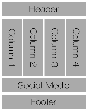
Desktop Resolution
(click image to view)
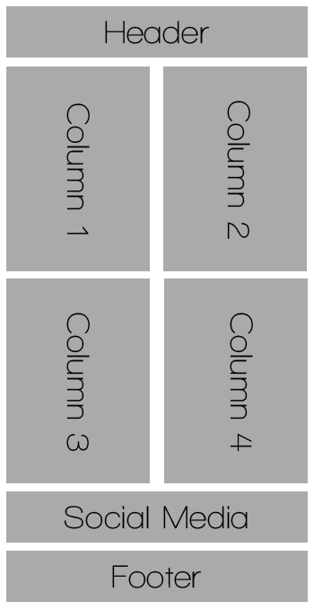
Tablet Resolution
(click image to view)
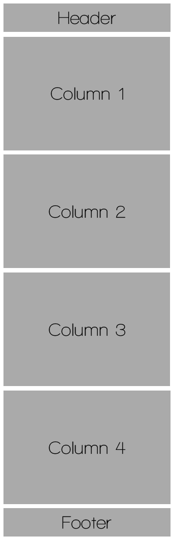
Smartphone Resolution
(click image to view)
Finally, insert this code into the header of your document:
<meta name="viewport" content="width=device-width" />
This sets the viewport to the device width. And there you have one website that is optimized for all resolutions! It completely eliminates the need to have a separate mobile or tablet website.
This is a super simplified example, but hopefully you can see what the possibilities are. You could make thumbnail images smaller on phones, remove entire sections on tablets, and even completely change background images on different resolutions if you want. The possibilities are endless.
Alternative: WPTouch
If you’re unable to find a responsive theme you like and are unable to create one yourself, the WordPress WPTouch plugin is an excellent alternative. Simply install the plugin and it automatically creates a separate mobile site for your blog!
Don’t try to reinvent the website!
We all want our blogs to be unique and stand out. But if you go too crazy with a unique design, you could just end up frustrating your viewers. People have certain expectations for websites, and it’s good if you do your best to follow them.
- Logo or blog name should be at the top of the page. Common locations are to the left of the navigation, or in the middle above or below the navigation. Alternatives only work well if they’re implemented nicely. Here’s a good example: Anna Reads. Seeing the site logo on the right is very rare, but in this case it works well! And the matching social media buttons below the logo fit in nicely in that spot.
- Your logo or blog name should be a link to your homepage. People usually assume it is one, so don’t disappoint them!
- Navigation should always be at the top (optionally: additionally at the bottom — but NOT instead of).
- Navigation should be in a logical order. The link to your “Home” page should always be first. The rest of the order doesn’t matter all that much, but make it logical. Group similar items together and put the most important ones first.
Use “alt” for all images
Ensure that you’re utilizing the “alt” attribute in all your images. This attribute is a way of providing “alternate text” for your graphics. The alternate text should essentially be a description or header for the picture. Search engines obviously can’t look at images and tell what they are, so the “alt” attribute helps search engines identify what pictures are so that they can show up in relevant searches.
Correctly formatted image code should look something like this:
<img src="https://www.nosegraze.com/ashley-photo.jpg" alt="Photo of Ashley" />
Make your own favicon!
If you can, create a favicon (“Favorite Icon”) for your website. You’re probably asking “why?” It’s a small thing but will help people easily identify your site amidst their many browser tabs.
Browsers that support favicons display them in the address bar next to the page’s URL, and next to the page’s title in the tab. Usually they’re also shown in the bookmarks list if the page is bookmarked.
Favicons can be created in a variety of image formats (PNG, GIF, JPEG, etc.), but I highly recommend that you use the ICO format. ICO is the only format that is accepted for all browsers. Use this table as a reference:
| Browser | ICO | PNG | GIF | Animated GIFs | JPEG | APNG | SVG |
|---|---|---|---|---|---|---|---|
| Firefox | Yes | Yes | Yes | Yes | Yes | Yes | No |
| Google Chrome | Yes | No | Yes | Yes | Yes | No | Yes |
| Internet Explorer | Yes | No | No | No | No | No | No |
| Opera | Yes | Yes | Yes | Yes | Yes | Yes | Yes |
| Safari | Yes | Yes | Yes | No | Yes | No | No |
| Source: Wikipedia | |||||||
As you can see, ICO is the only format supported by all browsers. So how do you make an ICO image? You can download a Photoshop plugin that will allow you to save images in the ICO format. I downloaded my plugin from here: Telegraphics ICO Format Plugin
Alternatively, there are a few favicon generators that allow you to upload an image, and then turn it into an ICO file. Here’s one example: Favicon Generator. Doing a simple Google search for “ICO Generator” will yield similar results.
Then, place this code in the head of your site, inside the “head” tags, as shown below:
<head>
<link rel="shortcut icon" type="image/x-icon" href="FAVICON URL HERE" />
</head>
Test your website across multiple browsers and versions!
This is like.. the big annoyance in the web design world. There are many different browsers out there, including Firefox, Chrome, Internet Explorer, Safari, and Opera. Unfortunately, all these browsers are a little different and render websites differently. Some of them have different rules or require hacks to make things work correctly. Make sure you test your website in as many browsers as you can, and in as many versions of those browsers as you can. Your design may require some tweaking for different browsers!
There are several new properties in CSS3 that require different implementation for each browser in order to work correctly. Here are a few examples:
Border Radius
-webkit-border-radius:15px; /* Safari & Chrome */
-moz-border-radius:15px; /* Firefox */
border-radius:15px /* CSS3 */
Border Image
border-image:url(border.png) 30 30 round;
-moz-border-image:url(border.png) 30 30 round; /* Firefox */
-webkit-border-image:url(border.png) 30 30 round; /* Safari and Chrome */
-o-border-image:url(border.png) 30 30 round; /* Opera */
Transitions
transition: width 2s;
-moz-transition: width 2s; /* Firefox */
-webkit-transition: width 2s; /* Safari and Chrome */
-o-transition: width 2s; /* Opera */
You get the deal…
Most of the newer CSS3 properties require you to use these “browser hacks” to accommodate the different browsers. Eventually, once CSS3 is finished, we probably won’t have to use them any more. But until then…
Gradients
Honestly the CSS3 gradient syntax annoys me so much that I usually use a generator like ColorZilla’s Ultimate CSS Gradient Generator. The syntax is annoying on its own, but it’s a million times worse when you have to deal with the different variations. Here’s a simple black » white gradient copy and pasted from the generator:
background: #000000; /* Old browsers */
/* IE9 SVG, needs conditional override of 'filter' to 'none' */
background: url(data:image/svg+xml;base64,PD94bWwgdmVyc2lvbj0iMS4wIiA/Pgo8c3ZnIHhtbG5zPSJodHRwOi8vd3d3LnczLm9yZy8yMDAwL3N2ZyIgd2lkdGg9IjEwMCUiIGhlaWdodD0iMTAwJSIgdmlld0JveD0iMCAwIDEgMSIgcHJlc2VydmVBc3BlY3RSYXRpbz0ibm9uZSI+CiAgPGxpbmVhckdyYWRpZW50IGlkPSJncmFkLXVjZ2ctZ2VuZXJhdGVkIiBncmFkaWVudFVuaXRzPSJ1c2VyU3BhY2VPblVzZSIgeDE9IjAlIiB5MT0iMCUiIHgyPSIwJSIgeTI9IjEwMCUiPgogICAgPHN0b3Agb2Zmc2V0PSIwJSIgc3RvcC1jb2xvcj0iIzAwMDAwMCIgc3RvcC1vcGFjaXR5PSIxIi8+CiAgICA8c3RvcCBvZmZzZXQ9IjEwMCUiIHN0b3AtY29sb3I9IiNmZmZmZmYiIHN0b3Atb3BhY2l0eT0iMSIvPgogIDwvbGluZWFyR3JhZGllbnQ+CiAgPHJlY3QgeD0iMCIgeT0iMCIgd2lkdGg9IjEiIGhlaWdodD0iMSIgZmlsbD0idXJsKCNncmFkLXVjZ2ctZ2VuZXJhdGVkKSIgLz4KPC9zdmc+);
background: -moz-linear-gradient(top,  #000000 0%, #ffffff 100%); /* FF3.6+ */
background: -webkit-gradient(linear, left top, left bottom, color-stop(0%,#000000), color-stop(100%,#ffffff)); /* Chrome,Safari4+ */
background: -webkit-linear-gradient(top,  #000000 0%,#ffffff 100%); /* Chrome10+,Safari5.1+ */
background: -o-linear-gradient(top,  #000000 0%,#ffffff 100%); /* Opera 11.10+ */
background: -ms-linear-gradient(top,  #000000 0%,#ffffff 100%); /* IE10+ */
background: linear-gradient(top,  #000000 0%,#ffffff 100%); /* W3C */
filter: progid:DXImageTransform.Microsoft.gradient( startColorstr='#000000', endColorstr='#ffffff',GradientType=0 ); /* IE6-8 */
Geeze, look at that!
Questions, comments, suggestions?
If you have any questions, comments, or suggestions for future tutorials, please post here and let me know! Coming up, I have some awesome code snippets that will really help make your website dynamic and automated. For example, I’ll be providing the code to create your own automatically updating index of book reviews by author and/or by title! Yay! Stay tuned. 🙂
Just made my own favicon!! Thanks!!!! 🙂